Pages

Showing posts with label quilting. Show all posts

Thursday, October 05, 2017

THE SECRETS QUILT


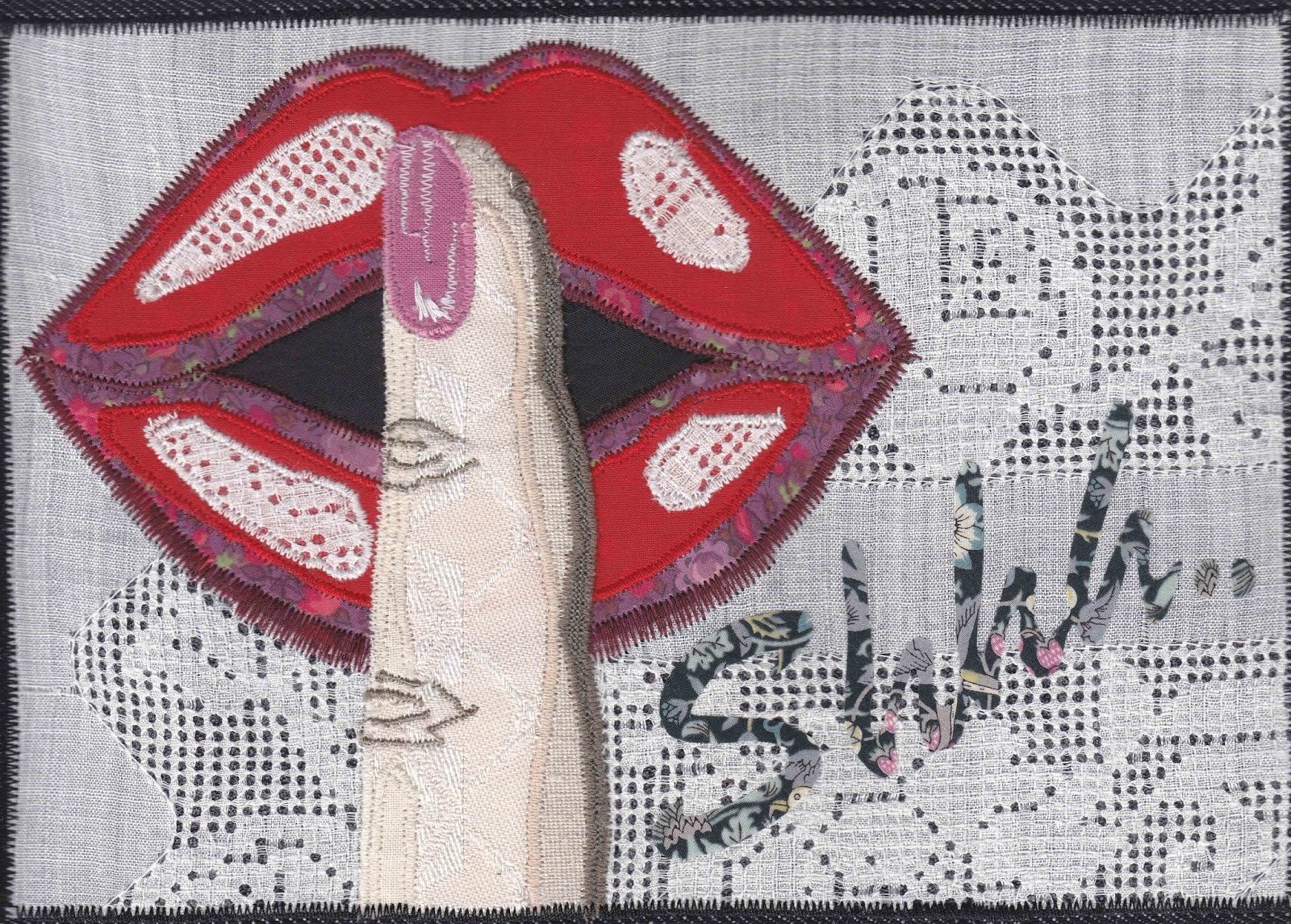
Psst; do you want to know a secret?

First, you'll have to tell us yours!

According to the Journal of Personality and Social Psychology, the average person keeps a whopping 13 secrets and five secrets that they have never told to another living soul!

Everyone knows that keeping things in is bad for us, so how do you find a safe and therapeutic way to let it go?

Well, you can sing about it, talk about it, write a letter and freeze it, write a poem and burn it, or shout your secret to the wind and let it carry your words off scattered in the breeze. 


Or you can give it to us: stitch your secret and send it to us for safe keeping.  Trivial, funny or deadly serious, it matters not.

Letting a secret go in a safe place allows you to forgive yourself and let the past go.  Sharing a secret is an act of self-love.

We are the Profanity Embroidery Group of Whitstable, Kent and you are invited to stitch your secret (profanity free) and make it part of an American style crazy quilt. 


The Secrets Quilt is a social media-generated art quilt celebrating therapeutic stitching. The aim is to excite people to stitch and feel the benefit of collaborative creativity.  We hope that by taking time to relax and unwind, whilst unburdening themselves, people will feel happier.

Feedback has already showed this is happening.  One stitcher, recovering from breast cancer told us, 'it has given me something quiet and soothing to do amongst all the annoying bits of life.'

Another stitcher said, 'while my depression not something I keep secret, I definitely don't acknowledge it as much as I should, especially to myself. So this secret is actually about me facing up to my challenges and learning to treat myself more kindly when I am having a bad time.'


Another said of her secret, 'it’s funny but since stitching this secret I feel empowered to be braver and 'come out' to my friends instead of saying nothing.'

We are inviting people to stitch their secrets on fabric no bigger than an iPad and send it to us by December 31 2017.  The secrets will be transformed into a quilt for national display in 2018.

The process is anonymous and anyone can contribute. All are welcome to take part in this project, beginners as well as experienced individuals.


Find out everything you need to know at:


Instagram @lovesecretsand

More information contact:

Bridget Carpenter bridgetmcarpenter@gmail.com


Thursday, September 21, 2017

THE SLEEP QUILT


Tracy Chevalier joins forces with charity to help prisoners build their self-esteem and hope


“It was a challenge. I had just joined Fine Cell Work. Caroline, the volunteer teacher, asked me to do a square for the quilt and explained what it was about. She said what do you guys dream about when in prison. I said to be honest I don’t dream any more. I haven’t dreamed for years. To me prison is all about madness and chaos and tattoos. Caroline saw my tattoos and said we haven’t got one of those on the quilt. To me tattoos and people are very similar. It tells a story of a time and a place, it’s a permanent marker. It’s like me on this earth. ” – Prisoner partaking in the Sleep Quilt project


“Prisoners may initially agree to work with Fine Cell Work because they will be paid, but most of them get far more out of the experience than money … Many inmates suffer from low self-esteem. They have never made anything constructive or beautiful before, and have never been praised. Doing so is like watering a dried-out plant and seeing it come back to life.” – Tracy Chevalier

The Sleep Quilt is unlike any other quilt you will have seen. Commissioned by Tracy Chevalier, it is entirely stitched and quilted by prisoners in the UK.

Each of the 63 squares explores what sleep means for them. A moment of escape for some, for others a dark return to all they most regret in life, sleep has a great significance in jail that is only strengthened by the difficulty of finding it in the relentlessly noisy, hot and cramped environment.

By turns poignant, witty, light-hearted and tragic, The Sleep Quilt shines a light on lives that few outside can imagine. An essay by Tracy Chevalier and an Introduction by Katy Emck, Director of Fine Cell Work, the charity that made the quilt possible, as well as many quotations from the people who have embroidered the 63 patches, frame this remarkable work launched by Pallas Athene Books on 31st October.

Each square, printed in full colour, appears on one page so that readers can fully appreciate both the outstanding craftsmanship required (often the fruit of weeks of patient dedication on the prisoners’ part) and the meaning conveyed by the artwork.

All royalties from the sales of the book will go to Fine Cell Work.

“The word ‘sleep’ conjures up memories of when I put my children to bed. ‘Wynken, Blynken, and Nod’ was a favourite bedtime story that I read to them frequently. My sleep quilt tells this story of three children who go fishing for stars in a wooden shoe.”

“I have always suffered with insomnia and often had to resort to using an eye mask… The sleeping woman represents me and my dream – love of the outside, the beach, owning a beach hut and a vintage VW camper van to drive around in and be a free spirit once again.”

“Sleep in prison can be sporadic. It is usually interrupted by thoughts of the past, maybe good ones but also regrets. Thoughts about friends, family and loved ones. Hopes and aspirations for the future. In designing my block I have taken my sleep thoughts and represented them as four hearts, each standing for a family member and their children, and also a close friend. The buttons inside the hearts represent the family members. Across the rest of the design is a scattering of buttons. The smaller ones represent dreams, aspirations and past happy thoughts and events. The large buttons represent the things in life that make it hard to achieve positive goals. However, these buttons can be broken and shattered into smaller particles, given time and the right direction in life.”
About Tracy Chevalier: An American-British novelist, best known for The Girl with the Pearl Earring, her interest in quilting was sparked by her research for a novel, The Last Runaway, and she is now a committed quilter. When the novel was published in 2013, she was contacted by Danson House, a Grade I Listed Palladian Villa in South East London, to curate a quilt show which she decided to call What We Do in Bed. At the same time, she was contacted by ‘Fine Cell Work’ to come and talk about her book to a group of prisoners. This experience made such a strong impression on her that she decided to commission a quilt from the prisoners for her show. It would be called The Sleep Quilt and prisoners were asked to express their feelings about sleep, either in images or words or both.

About Fine Cell Work: a charity and social enterprise that runs rehabilitation projects in thirty British prisons by training prisoners in paid, skilled, creative needlework, undertaken in the long hours spent in their cells, to foster hope, discipline and self-belief.


“I pondered the necessity of prisoners having something worthwhile to do during their long hours of lonely idleness. I wanted that work to be creative, enjoyable, worthwhile and saleable. I was determined that the work should be a professional standard, no whiff of charitable acceptance about it, and should be something of which its creator could be proud and our future buyers wish to own. I wanted the prisoner on release to have as much money as he or she had earned.” Lady Anne Tree, Founder of Fine Cell Work

“As an officer you have to wear two hats. It's a bit of a split personality. With Fine Cell Work you suddenly realise you're a human being and not just a uniform. Prisoners come and talk to you and realise you're a human being too. I am doing something for a worthwhile charity and possibly giving inmates who have an entrenched view of ‘The System’ a different angle to consider”. Officer, HMP Wandsworth


The Sleep Quilt, a collaboration between Tracy Chevalier and charity ‘Fine Cell Work’

Published by Pallas Athene Books

Hardback; 80 colour photographs; 145 x 145 mm 240pp; £14.99

ISBN: 978 1 84368 146 5


A Kickstarter crowd-funding campaign has been started, through which the publisher is planning to fund at least part of the books’ printing (all funds raised via Kickstarter will go towards the book and to the charity itself). Kickstarter is a website allowing people to raise money for arts-based projects.

The Sleep Quilt’s Kickstarter initiative ends mid-November. The link is: http://bit.ly/TheSleepQuiltKickstarter

Tuesday, January 10, 2017

New Quilting at the Rheged Centre


A new exhibition at Rheged, Cumbria’s foremost arts centre, supported by Arts Council England, will challenge perceptions of quilt making this spring, revealing a strong and vibrant contemporary craft form.

New Quilting, an exclusive exhibition at Rheged, will reveal the new face of contemporary quilting, an art form now just as likely to be found hanging on a gallery wall or urban loft apartment as it is in a rural farmhouse. Quilts by over 30 national and Cumbrian makers have been selected for their craftsmanship and design, colour and innovation. The unique story behind each piece will also be told in the exhibition, either through accompanying sketches and material revealing how each quilt came to be, or through the storytelling ability of the quilt itself.

Alicia Merrett: The Island

John Stokes, Arts Manager at Rheged, said “Quilting has been part of the needlework tradition in Europe since the fifth century and our exhibition celebrates those continuing the tradition today. Quilting is alive and kicking in the modern art world and from handmade fashion to 3D quilts, modern, traditional, pictoral and geometric, visitors will discover the handiwork and dedication required to produce these extraordinary creations. The work which goes into producing each quilts is immense. One quilt, ‘Log Cabin Craziness’ features more than 40,000 pieces of fabric and took 5 months for the artist, Joy Salvage, to complete.”

Ramona Conconi: CMYK

Thanks to funding from Arts Council England, New Quilting will also incorporate a community arts project with locally based artist Maddi Nicholson. She will work with the Levens Quilters group to produce a new piece of contemporary artwork that uses quilting as its medium. The themes of the piece will be local folklore, with more details to be revealed soon.

The exhibition is open to the public from Friday 3 March till Sunday 23 April, from 10am to 5pm daily. Admission is £2.

The complete list of artists: Abigail Booth, Alicia Merrett, Eileen Blood, Elfriede Grooten, Elizabeth Brimelow, Eszter Bornemisza, Greta Fitchett, Helen Howes, Janet Twinn, Jen Kelson, Joy Salvage, Judith Wilson, Kate Crossley, Kate Dowty, Marijke van Welzen, Marita Lappalainen, Michael Fitchett, Monika Steiner, Ramona Conconi, Sandie Lush, Sandy Chandler, Sara Impey, Susan Briscoe, Trudi Wood, Vera and Ctibor Skoček , Janice Gunner, John Winn, Sheena Norquay, Margery Milnes, Cas Holmes, Christine Chester

Vera and Citibor Skocek


About Rheged
Rheged is located just off the M6 (J40) at the northern gateway to the Lake District, which is the birthplace of modern rock climbing and home to some of the world’s most famous mountaineers. Rheged is a family run centre for Arts, Food and Family activities, all of which are of this place. Rheged is also a building of architectural merit, with one of the largest grass covered roofs in the country. The Gallery at Rheged won Gallery of the year in the 2016 Cumbria Life Culture awards.

@RhegedCentre 


Michael Fitchett: Shambles

Thursday, September 16, 2010

The Enduring Antarctic Adventure of Clare Plug

 Illustration: Clare Plug. Ice Crack 2, 2008.

The New Zealand textile artist Clare Plug has spent the last few years of her career developing a fascinating body of work that entails intimately observed details along with wider conceptions and observations of the most rarely visited of all the planets continents.

In 2006 Plug was lucky enough to visit the continent of Antarctica as part of a fellowship, staying with the official government Antarctica NZ at Scott Base in the vicinity of the Ross Ice Shelf. It is no small exaggeration to say that this experience fundamentally changed her views and the entire aspect of her work, so much so that much of the textile art work that she produces to this day is haunted by this most spectacular and hauntingly beautiful continent.

Illustration: Clare Plug. Ice Crack 2 (detail), 2008.

The three works shown here are examples of Plug's Antarctica Series which explores a number of aspects of the continent from the fragile and relatively recent human experience, to the much older and grander sweep of geological and climatic history that has become so pressingly relevant in our own contemporary world.

Through discharge dyeing, applique and quilting techniques, Plug has been able to not only detail her own experiences along with those of others past and present, but perhaps more importantly to focus our attention on the emotional ambience of the landscape and the sense of harsh beauty that it entails. Through her sensitive use of textural colour and stitching, the artist can help us to identify the strange combination of a climate that is so harsh that it can kill most life forms, while at the same time being supremely fragile, delicate and sensitive and so easily prone to destruction by outside forces.

Illustration: Clare Plug. Midnight at the Barne Glacier, 2008.

These moody and sometimes even ethereal textile pieces are in many regards emotionally observed landscapes. Admittedly, they can only give us an indication as to the multiple experiences that would be observed on the continent itself. However, Plugs work has such a defined ambient compositional quality to it that although most of us will probably never visit the continent itself, we can at least share some of the wonder and sheer magnetism of this most intriguing and other-worldly part of the planet.

Through her landscapes, both climatically and geographically based, humans seem to make only the barest and most tenuous of impressions. No more obvious an example of this underlying feeling is Out on the Barrier which seems to give a hint of a hauntingly indistinct portrayal of a possible human symbol, or not. To show our lack of domination of one continent out of seven, everything in Antarctica seems transient, misleading, even misdirected seeming at times to be playing tricks on our senses and our preconceptions. The physical and emotional scale of the experience seems well beyond the human scale in which to focus, catalogue and identify. This often featureless and unimaginably empty continent challenges us to imagine a world where the human species cannot automatically deem themselves dominant, and for our own sanity that feeling of inadequacy mixed with awe, can only be for the betterment of us all.
Illustration: Clare Plug. Out on the Barrier, 2008.

A wide range of Plug's textile art pieces were part of the Look South exhibition held at the Canterbury Museum in Christchurch New Zealand. This exhibition was due to continue until the end of September. However, due to the major earthquake experienced by South Island, the exhibition has had to disappointingly close early, though I am sure Plugs hauntingly beautiful textile work will be seen at many more venues in the near future.

Clare Plug has a web presence where much more of her work can be seen. She has exhibited in New Zealand, the US and Europe as well as being featured in a number of publications. Another interesting site listed is that of Antarctica NZ which gives details of New Zealand's official work in Antarctica as well as information on Scott Base where Plug stayed in 2006. On the site there is a webcam of the base which updates every 15 minutes. Both sites can be found in the Reference links section below.

Illustration: Clare Plug. Out on the Barrier (detail), 2008.

All images were used with the kind persmission of the artist.


Reference links:
Clare Plug website
Antarctica New Zealand

Wednesday, August 11, 2010

Mixed Media Artist Judith Plotner

Illustration: Judith Plotner. Adirondack Journal I.

Many creative journeys are supremely private; others less so, many are degrees in between. The work of textile and mixed media artist Judith Plotner, although largely falling into the former category, can still be considered purely as an example of the rich world that can be composed from the elements that go to make up a mixed media base.

Illustration: Judith Plotner. Slate Valley.

Plotner uses the broad spectrum of the creative arts, bringing into her compositions the sensibilities of a fine art painting background, as well as that of printmaking, collage and textiles. The great strength of mixed media is the fact that layering and juxtapositioning can be achieved not only with the raw materials available within the different mediums, but also with that of mediums themselves. It is always fascinating to observe how sometimes a medium can complement another, while at other times the opposite can be both the aim and result. This can cause tension within a composition, which can be intentional on one level, but have reactions and unforeseen results, sometimes on more than one level.

Illustration: Judith Plotner. Adirondack Journal III.

The compositions chosen for this article seem reminiscent of small contained packages as if they were enclosed personal observations of the artist themselves. In some respect, that is exactly what they are. These observational diary pages if you will contain information, thoughts and muses, often scattered and seemingly random, though often connected by both the individual and the experience.

There is a sense of confinement that is physically attached to the compositions. The surrounding and inert space of these observational essays can seem to isolate the experience, but in fact, it is much more a case of the outside space allowing the artist to pinpoint an experience. This helps to discover and identify the completed observation and in some ways allow the outsider to study at least some elements of the parameters that contain the thoughts and processes of the artist.

Illustration: Judith Plotner. Autumnal.

Although the outside observer is not privy to the internal creative workings of the artist, whether that be personalised or externalised observations and encounters, they can in some respects be privy to the journey itself. By understanding the practical application of mediums and materials, whether that be through layering, stitching, stamping, dyeing, painting or printing, this functional part of the creative journey can be both observed and admired.

It is said that all creativity is subjective, and in many respects that is true. However, often the practical working journey of materials and processes used by the artist can be objectively followed, sometimes producing profound or at least interesting analogies and discoveries.

These five compositions of Plotner's are finely tuned and specifically composed. They are an interesting example of both the personalised experience of an artist, but also of the sometimes complex procedures that can entail the practical application of a mixed media artist. The compositions are wide ranging in their use of mediums and materials and show the genuine creative scope that can be found within the mixed media world.

Illustration: Judith Plotner. Global Warming.

Judith Plotner has exhibited extensively across the US. She has her own comprehensive website where many more examples of her work can be found. A link to the site can be found below.

All images were provided with the kind permission of the artist.

Reference links:
Judith Plotner website

Monday, August 02, 2010

Contemporary Textile Work of Artist Marlene Cohen

Illustration: Marlene Cohen. Healing.

Marlene Cohen is a British textile artist that has taken her own strong and contemporary attitude towards her chosen medium, and created a distinctive style of composition and layering that is entirely her own. Cohen uses both printmaking and fine art disciplines, along with the usual aspects of textile work such as layering and stitching, to produce work that although technically part of the quilt medium, has managed to stretch that medium farther than most.

Although Cohen works in a wide range of colours, tones and textures, I have chosen instead to concentrate on a series of pieces that she has produced in a much lower and much more minimal colour scheme. Shoah is a series of pieces that, although seemingly stark and severe, are in fact full of the most astounding build up of imagery and text that is strong in graphic, illustrative and fine art techniques.

Illustration: Marlene Cohen. Target Zero.

These pieces, to my mind at least, seem to have a number of reference points that lead to the drawing of similarities to some aspects of the leading edge of European graphic design work in the 1920s and 1930s, particularly those artists and designers who dealt with the exciting photomontage medium. However, Cohen's work could never be said to be derivative of that era. What it does share is that same powerful and uncompromising imagery that places it at the forefront of the senses. This work is not meant to be harmonious with its background, but is meant to make an uncompromising statement and in this it shares a position with so much of the fine art and design work that that was at the forefront of the Modernist movement.

This series of textile pieces is extraordinary in it's focused awareness of what is truly achievable through the textile medium, rather than what is expected or delivered. It is uncompromising and skilful, and although dealing with historical issues that are highly personalised, the compositions can also appeal on a much wider level, those dealing with compositional balance, graphic awareness and strident ambience.

Illustration: Marlene Cohen. Cover Up.

It is artists such as Cohen who are both pushing the boundaries of what is expected and accepted as textile art, and also and perhaps more importantly, expanding the parameters of fine art itself, allowing it to ultimately include aspects of textile work on an equal basis. Cohen's work seems to deliberately cross over various discipline boundaries and so her work can well be appreciated by individuals who have a background and interest in general textiles, quilting, printmaking, graphics, illustration and fine art.

The more expansive and uncompromising textile artists become in both their focus and their range of creativity while at the same time retaining the unique aspects of the textile medium, the more seriously textile art will be taken outside of the immediate discipline. Cohen is an artist that is at the forefront of this movement towards fine art acceptability.

Illustration: Marlene Cohen. Mixed Messages.

Marlene Cohen has exhibited widely, she lectures and writes profusely and has her own comprehensive website where much more of her work can be seen, along with the imagery shown in this article. The website link can be found below in the Reference links section.

All images were provided with the kind permission of the artist.

Reference links:

Wednesday, July 21, 2010

Barbara W Watler and the Fingerprint Collection

Illustration: Barbara W. Watler. Fingerprint series #50: Unity.

The textile artwork of Barbara W. Watler is intriguing in more ways than one. She gives us blown up images of small, intimate areas of life that we might well recognise as belonging to part of the near micro world. Through her unique imagery of the natural world that she sees around her, the artist allows us to connect to the intimate and the solitary, pinpointing the stand alone elements that make all aspects of the natural world unique. She helps us to understand how utterly unique and diverse this world really is.

Illustration: Barbara W. Watler. Fingerprint Series #46: Vortex.

Watler has a number of differing projects and sets of work, but probably her most well known series is that of her Fingerprint collection. This series of art pieces that now number more than fifty, is continually growing and transforming as it develops. It deals with the all too human twin obsessions of identity and the loss of that identity. Fingerprinting is a near unique aspect of our human world, one that cannot be quantified, packaged, or mass-produced. It has been a unique feature of the thousands of generations before us, the six and a half billion of us today, and of the thousands of generations that will follow us. In some respects these are large abstract maps of our own individuality, showing us that we are more complex than we often appreciate.

Illustration: Barbara W. Watler. Fingerprint Series #46: Vortex (detail).

By concentrating on this aspect of human development she has in fact pinpointed, through compositional means, both a uniqueness that is such an integral part of the ideal of the individual, and through that the uniqueness that can easily be attributed to each of her works in this series. All are unique and all stand alone. This one of a kind perception underlines and matches the same values that can be found in the human species.

Watler takes the simple idea of honing in on a small element of the human body and expanding it to utterly fill a composition. However, although the idea itself may appear to be simple, it is full of meaning and sophistication. By highlighting the seemingly inconsequential aspect of the end of a finger and allowing it to fill a compositional space to the edge, the artist gives the fingerprint the emphasis it has always had in nature, but which is so frequently neglected in our own human world.

Illustration: Barbara W. Watler. Fingerprint Series #16-20: Painter's Prints.

The uniqueness of each and every one of us is often underplayed and trivialised even amongst our own species. We have become, over the last century and a half, standardised consumers. The retail, financial and media empires regularly bracket us within spending and lifestyle parameters. To class us as individuals within our contemporary world is counter productive. It is a world that no longer values our uniqueness, but sees us as part of the mass production machinery.

Watler gently reminds us that although we may well be part of a mass organism of six and a half billion units, each of those units is a specifically unique, never to be repeated individual. For us to forget that fact puts our humanity in jeopardy.

Illustration: Barbara W. Watler. Fingerprint Series #42: Elephant Print.

Barbara Watler work has been seen in various exhibitions across the US. Her unique style, both within the Fingerprint series and beyond, has proved both popular and successful. She has a comprehensive website where much of her work can be seen, a link to which can be found below in the reference links section below.

All images were used with the kind permission of the artist.

Reference links:

Monday, July 12, 2010

Jette Clover and the Graffiti of Life

Illustration: Jette Clover. White Wall 1, 2009.

The work of the textile and mixed media artist Jette Clover deals with the graffiti of life. She has chosen to represent the visual language of the human species through the use of the written, rather than that of the spoken language. This is an important point to make, particularly as the written word becomes evermore increasingly vital to the everyday running of our contemporary world. However, although written language itself is relatively new in comparison to the age of the human species as a whole, representational markers of our presence have long been seen as a necessary part of our lives. Whether writing with recognised lettering, pictograms or other symbols, all are representations of both the individual and the culture they inhabited. It is this recognition of the potential of the individual through mark-making in whatever fashion, which seems to be at the heart of these particular pieces of textile work.

Illustration: Jette Clover. White Wall 2, 2009.

The six pieces of work shown in this article were produced by Clover in 2009. It is relatively easy to recognise the influence and inspiration of the partial layering that can be found on a poster plastered wall in any contemporary town or city. These multi-layered poster walls can easily take on the guise of fragmentary messages that are visible through layers of information. Clover has cleverly drawn analogies between this imagery from our contemporary world, and given it meaning and dimension well beyond its immediate remit.

Illustration: Jette Clover. White Wall 3, 2009.

Clover is interested in not only the scattered and disconnected markers left by generations of the human species, but more importantly to all of us on a much more personal level, the wish to leave a presence of ourselves in some form. Graffiti itself can be seen as a wish fulfilment of the human spirit. I was here is perhaps the crudest but most effective form of at least partial celebrity if not full-blown immortality. To be remembered, if only partially, is all that many of us wish, and future generations may well understand us only on a level that can be recognised through Clover's work, a letter here a number there, all the rest has been obliterated.

Illustration: Jette Clover. White Wall 4, 2009.

It is this obliteration that is interesting within this specific set of work by Clover. It is called the White Series, and although, to some extent it is an exercise in the exploration of the lack of colour contrasts and the simplicity that can be found in shades of white, it is also a representation of much more.

We as individual observers have to peer at the visual vocabulary that has been set out for us. Very little is made clear to us and we can only surmise as to the messages that were originally intended. This gives us a very acute awareness as to how future generations observe and portray the past. All that was our lives has been truncated and randomly edited. This is not who we were, but it is who we will eventually become. To see and interpret the human species, and through that the human condition, through a partially whitewashed wall is an extremely clever and sophisticated analogy, and all admiration has go to the artist fir portraying it as such.

Illustration: Jette Clover. Whitewash, 2009.

The visual vocabulary shown in these pieces of work are of such a permanent and instantly recognisable nature. They so clearly represent the human capacity and longing to project meaning with words. More importantly still is the longing to project life and longevity into those words. What appears at first to be nothing more than the transitory nature of poster art becomes a need for both the continued representation and even hope for the perpetuation of countless successive generations.   

Jette Clover has shown her work extensively in both North America and Europe. She has been featured in a number of publications, also on both sides of the Atlantic. She has a comprehensive website where much more of her work can be seen, along with an extensive list of exhibition highlights where her work can be seen through till Summer 2011.

Illustration: Jette Clover. Whitewash 5, 2009.

All images were used with the kind permission of the artist.

Reference links:
Jette Clover website

Wednesday, June 16, 2010

Virginia Abrams Reflections

Illustration: Virginia Abrams. Reflections 5, 2009.

I am always pleasantly surprised and even intrigued when considering how many contemporary textile artists arrive at the genre from such diverse creative journeys and backgrounds. It perhaps says much about the comprehensive appeal of textile art that so many individuals feel compelled to take up the genre. Obviously, because of the diversity of these individual artists, textile art itself broadens its parameters immensely.

The American textile artist Virginia Abrams has a background in organic chemistry and biochemistry. She is fascinated with the complex interactions of the natural world and her work is centred on this fascination. Abrams work runs on themes suggested by nature. I have chosen one of these themes water, to illustrate this article. All of these pieces are literally reflections. However, it would be misleading to believe that they are merely optical observations conceived by Abrams. These are complex recipes using ingredients of light, air and water, all with shifting parameters. Each element adds its unique quality to the composition.

Illustration: Virginia Abrams. Reflections 1, 2008.

It is the combination and arrangement of elements that is the important point to remember when contemplating the nature of Abrams work. In what can appear to be an almost scientific fascination with the symbiotic partnership of the elements that are part of the makeup of the natural world, the artist draws our attention to the complexity of each moment. How each element contacts and subsequently influences the other is a fascinating creative exploration. We are asked to consider how many procedures and how many connections have to be made in order for water to ripple and for a reflection to be disturbed.

Illustration: Virginia Abrams. Reflections 4, 2009.

In some respects, these compositions are frozen moments in time, never to be repeated exactly with those particular elements and with those particular parameters. This implies that all connections with nature, particularly those as experienced from the human conception, are fleetingly unique moments in time. The proportions of Abrams compositions are therefore also unique; showing us a snapshot of a complex series of actions and reactions that take place between light, air and water with the added, but all important element as far as textile art is concerned, of colour and tone.

What seems to work exceptionally well in these particular compositions is that of the tranquil, balanced and seemingly limited colour palette, which on closer inspection is of course anything but simple. It entails a much more complex and accomplished use of colour, tone and texture on the part of the artist. However, the contemplative nature of the compositions draws the individual towards a sense of introspection of an almost meditative quality. Perhaps it could be said that these particular compositions are reflective in more ways than that of the obviously optical and observational.

Illustration: Virginia Abrams. Reflections 3, 2008.

Abrams work is impressive on both art and craft level. She has an intrinsic understanding of the balance and harmony that can be achieved through correct composition. Her confident use of materials and textile skills adds to the winning combination, helping to take the genre of textile art to yet another level of achievement.

There is a link to Virginia Abrams comprehensive website in the reference links section below, where many more of her textile art pieces can be found.

Artwork is reproduced with the kind permission of the artist.
Illustration: Virginia Abrams. Reflections 6, 2009.

Reference links:
Virginia Abrams website