Pages

Showing posts with label quilts. Show all posts

Thursday, October 05, 2017

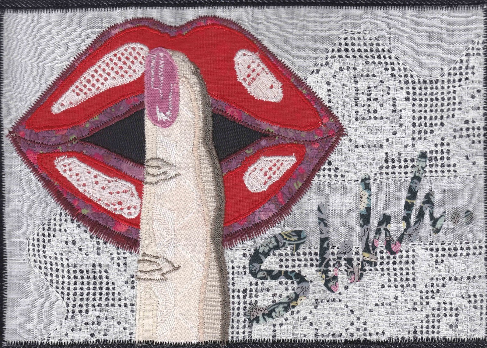
THE SECRETS QUILT


Psst; do you want to know a secret?

First, you'll have to tell us yours!

According to the Journal of Personality and Social Psychology, the average person keeps a whopping 13 secrets and five secrets that they have never told to another living soul!

Everyone knows that keeping things in is bad for us, so how do you find a safe and therapeutic way to let it go?

Well, you can sing about it, talk about it, write a letter and freeze it, write a poem and burn it, or shout your secret to the wind and let it carry your words off scattered in the breeze. 


Or you can give it to us: stitch your secret and send it to us for safe keeping.  Trivial, funny or deadly serious, it matters not.

Letting a secret go in a safe place allows you to forgive yourself and let the past go.  Sharing a secret is an act of self-love.

We are the Profanity Embroidery Group of Whitstable, Kent and you are invited to stitch your secret (profanity free) and make it part of an American style crazy quilt. 


The Secrets Quilt is a social media-generated art quilt celebrating therapeutic stitching. The aim is to excite people to stitch and feel the benefit of collaborative creativity.  We hope that by taking time to relax and unwind, whilst unburdening themselves, people will feel happier.

Feedback has already showed this is happening.  One stitcher, recovering from breast cancer told us, 'it has given me something quiet and soothing to do amongst all the annoying bits of life.'

Another stitcher said, 'while my depression not something I keep secret, I definitely don't acknowledge it as much as I should, especially to myself. So this secret is actually about me facing up to my challenges and learning to treat myself more kindly when I am having a bad time.'


Another said of her secret, 'it’s funny but since stitching this secret I feel empowered to be braver and 'come out' to my friends instead of saying nothing.'

We are inviting people to stitch their secrets on fabric no bigger than an iPad and send it to us by December 31 2017.  The secrets will be transformed into a quilt for national display in 2018.

The process is anonymous and anyone can contribute. All are welcome to take part in this project, beginners as well as experienced individuals.


Find out everything you need to know at:


Instagram @lovesecretsand

More information contact:

Bridget Carpenter bridgetmcarpenter@gmail.com


Monday, August 02, 2010

Contemporary Textile Work of Artist Marlene Cohen

Illustration: Marlene Cohen. Healing.

Marlene Cohen is a British textile artist that has taken her own strong and contemporary attitude towards her chosen medium, and created a distinctive style of composition and layering that is entirely her own. Cohen uses both printmaking and fine art disciplines, along with the usual aspects of textile work such as layering and stitching, to produce work that although technically part of the quilt medium, has managed to stretch that medium farther than most.

Although Cohen works in a wide range of colours, tones and textures, I have chosen instead to concentrate on a series of pieces that she has produced in a much lower and much more minimal colour scheme. Shoah is a series of pieces that, although seemingly stark and severe, are in fact full of the most astounding build up of imagery and text that is strong in graphic, illustrative and fine art techniques.

Illustration: Marlene Cohen. Target Zero.

These pieces, to my mind at least, seem to have a number of reference points that lead to the drawing of similarities to some aspects of the leading edge of European graphic design work in the 1920s and 1930s, particularly those artists and designers who dealt with the exciting photomontage medium. However, Cohen's work could never be said to be derivative of that era. What it does share is that same powerful and uncompromising imagery that places it at the forefront of the senses. This work is not meant to be harmonious with its background, but is meant to make an uncompromising statement and in this it shares a position with so much of the fine art and design work that that was at the forefront of the Modernist movement.

This series of textile pieces is extraordinary in it's focused awareness of what is truly achievable through the textile medium, rather than what is expected or delivered. It is uncompromising and skilful, and although dealing with historical issues that are highly personalised, the compositions can also appeal on a much wider level, those dealing with compositional balance, graphic awareness and strident ambience.

Illustration: Marlene Cohen. Cover Up.

It is artists such as Cohen who are both pushing the boundaries of what is expected and accepted as textile art, and also and perhaps more importantly, expanding the parameters of fine art itself, allowing it to ultimately include aspects of textile work on an equal basis. Cohen's work seems to deliberately cross over various discipline boundaries and so her work can well be appreciated by individuals who have a background and interest in general textiles, quilting, printmaking, graphics, illustration and fine art.

The more expansive and uncompromising textile artists become in both their focus and their range of creativity while at the same time retaining the unique aspects of the textile medium, the more seriously textile art will be taken outside of the immediate discipline. Cohen is an artist that is at the forefront of this movement towards fine art acceptability.

Illustration: Marlene Cohen. Mixed Messages.

Marlene Cohen has exhibited widely, she lectures and writes profusely and has her own comprehensive website where much more of her work can be seen, along with the imagery shown in this article. The website link can be found below in the Reference links section.

All images were provided with the kind permission of the artist.

Reference links:

Monday, April 26, 2010

Erin Wilson's Quilted Short Stories

Illustration: Erin Wilson. Short Story #4, 2009.

The textile artwork of Erin Wilson at first seems effortlessly simple. Small boxes are repeated in a composition that includes regular rows and columns. However, when you consider that each small frame has been individually and consciously designed as a unique composition, and that some of Wilson's finished pieces can incorporate a large number of individual small framed art pieces, then the task set by the artist becomes much more one of quiet construction, with each individual square being seen as a world in itself.

All the fabrics are hand dyed by Wilson and so therefore, each compositional piece of artwork takes that hand dying into consideration, bringing a harmony and balance to the many individual works that go into making Wilson's textile pieces.

Illustration: Erin Wilson. Short Story #5, 2009.

In some respects, the artist has taken the idea of the mechanics of quilting and the production of pattern work into the realms of personal exploration and identity. Each one of the squares shown in these examples of Wilson's work is a window to a creative story. What is impressive is the number of unique creative stories that the artist has incorporated into some of her finished pieces of work. There are textile compositions where the artist has incorporated up to 168 individual squares, each one personally produced with the optimum in balance, proportion and harmony.

Wilson's work is one of both dedication and a unique awareness of the many individual aspects of creativity that layer each piece of textile artwork. She works hard to harness the compatability of all strands of her compositions. Her work can be seen and appreciated in both close detail and as a larger whole. There is an accord between each individual frame and its neighbour. All can then become part of a much larger and more dynamic framework. 

Illustration: Erin Wilson. Short Story #3, 2009.

In many respects, Wilson's compositions can be seen as representations of tenements or housing blocks. Overall, housing blocks are standardised and constructed from mass produced elements with no room for personal flare or individuality. However, within these externally standardised communities each window bares a slightly different vista to the world, despite the regular repetition of each frame. This gives us an analogy whereby we become aware that even though all windows are the same, the people looking through them are all uniquely individual with a life story of achievements and dreams that are unique to them and shared by no one else. However, all the unique windows go on to make a larger whole, so while we are all relatively isolated in our uniqueness, we are still all part of the human community and the ongoing story of that community. In fact, as the titles suggest, these can all be seen as varied and universally distinct short stories.

 Illustration: Erin Wilson. Short Story #1, 2008.

Perhaps Wilson is giving us a glimpse of our own potential to be creative within the framework of our lives. We may all be made from the human template, but we also have the ability to create the parameters of our own distinctiveness.

Erin Wilson is a full time textile artist and has shown her work across the US. She has a comprehensive website where much of her unique work can be seen. The link to her website can be found below, as always in the reference links section.

Illustration: Erin Wilson. Short Story #2, 2009.

All images were reproduced with the kind permission of the artist.

Reference links:

Friday, February 12, 2010

Ellin Larimer and the Journey of the Line

 Illustration: Ellin Larimer. Winter.

Ellin Larimer's work celebrates colour, texture, and ultimately that of the drawn line. Through textiles, Larimer is able to express an innate understanding of both the complexities and subtleties that are involved within the parameters of a fine art context.

Through the five pieces shown here, part of her Counterpoint series, Larimer takes segments of her work and produces through a fascinating process of construction, deconstruction, and reconstruction, a composition that flows in harmony colourwise, but seems to stagger with juxtapositions, linewise. There is a strange mixture of both tranquillity and movement within the work. The colours and textures play their part in allaying any fears the eye might have as to harsh, sharp, or drastic breaks in the composition, while the drawn line still retains these elements it seems less so because the clever use of colour balance. 

Illustration: Ellin Larimer. Tumult.

There lies the strength in Larimer's compositions. These are not mere cut-ups rearranged in order to form an all over pattern. In fact, all elements of the finished piece go to make up the ultimate journey of the drawn line, a line that uses both colour and texture as its support. The line that Larimer ingeniously draws, takes numerous pathways that at first glance appear to be mostly false starts, but in a way it is true to say that the journey of the drawn line is constantly reinvigorated and recreated. There is never a beginning or an ending to Larimer's work as everything folds in on itself. Whenever it appears that there may be a loose strand unaccounted for, that strand is taken up again and led somewhere else.

Illustration: Ellin Larimer. Verdant Counterpoint.

This constant journey of colour, texture, and line shows a confidence in some of the subtler aspects of fine art drawing which is often made more complex and harder to achieve by the very nature of those mediums. Trying to take a line on a journey using textiles as a base is particularly difficult.

With this particular set of five textile pieces, Larimer is confident in taking us deep within the constructs of her compositions. Follow a line and you are led deep within the confines of her creation on an endlessly looping pathway going behind and underneath, only to reappear again in a slightly different place at a different level. There is no real beginning and definitely no end to this journey and nor should there be.

Illustration: Ellin Larimer. Red Mums in Cloud Shape.

Ellin Larimer has exhibited her work extensively across the US. She has a comprehensive website where much more of her work can be seen. The website is listed below in the reference links section.

All images were provided with the kind permission of the artist.

Illustration: Ellin Larimer. Earth.


Reference links:

Tuesday, February 02, 2010

The Tensions of Nature as Seen by Textile Artist Pat Pauly

Illustration: Pat Pauly. Water, Earth II, 2008.

I have chosen three pieces to represent the textile artwork of Pat Pauly. They are all part of a series she has entitled Water, Earth and are a good indication as to the techniques that Pauly has imbued her work with.

Pauly's use of a bold, but confident colour palette is strikingly made apparent in these pieces. It is not a particularly easy path to take and is often fraught with problems, as colours have to be guided so that a careful balance is achieved. This is made all the more complex by Pauly's extraordinarily broken and fragmented compositions. These compositions seem at times to be combinations of mini-compositional structures. Water, Earth II for example, has five distinctive areas that could be classed as unique compositions that have been cleverly connected to each other in one piece, clearly opposing yet harmonising at the same time. However, Water, Earth IV is even more skilful, as the top part of the composition appears to have collided with the bottom half, the large textured and coloured leaf being used as the element to prise apart a route for the higher compositional segment into that of the lower.


Illustration: Pat Pauly. Water, Earth IV, 2007.

Pauly is well aware of the tension that can be found in the natural world. That some of her compositions in this series seem, at least at first viewing, to be concerned with the structures and textures of the natural world is misleading, as a closer inspection of the work soon makes you aware. Pauly's work goes much deeper than the surface of nature that we are all generally aware of. She is much more concerned with that of the tension, even fractured forces, and elements that lie deeply hidden underneath the coloured and textured surface of the natural world. The juxtaposition of the strata of colour and texture that she is able to build up in some segments of the composition, are seemingly placed next to areas that show a much more distressed, strained and even forcibly broken natural strata, which shows a very high level of compositional awareness.

Pauly achieves much more than an interesting arrangement of colour and texture with the Water, Earth series. She is able, through a textile format, to show us the stresses and strains that are part of the natural world. Through her imaginative use of fabric, she can offer us a glimpse of the juxtaposition of tension and harmony that is part and parcel of the natural world that we are not always aware of, though should be.

Illustration: Pat Pauly. Water, Earth I, 2007.

Pat Pauly is not only a textile artist and exhibition designer, she also finds time to lecture widely and run a number of workshops concerning various aspects of textile art. Her work has been seen extensively across the US since the 1980s. She has a number of exhibitions lined up for 2010. All of this and more can be found at her comprehensive website, which can be found at the link in the Reference links section below.

All images are produced with the kind permission of the artist.

Reference links:

Tuesday, January 26, 2010

Helene Davis and Hand Dyed Artwork

Illustration: Helene Davis. Black Rain.

Probably the most fundamental and guiding principal that colours, literally, the work of textile artist Helene Davis is that of her passion for hand-dyed fabric. Davis, after using bought quilting fabrics for a number of years, moved into the process of hand-dying her own fabrics, making each quilting project a much more personal and individual process.

Illustration: Helene Davis. Black Rain (detail).

Hand-dying is an exciting but often less than accurate medium in which to work. It takes a lot of skill, time, and patience in order to arrive at a range of fabrics in colour-ways, tones, and scale that can easily be worked with. The fact that the images shown in this article have arrived at that point, is easily evident. Davis is in control of the medium from start to finish. By producing her own dyed fabrics, she is able to forge a link between colour and texture that is both personal and individual, something that can never be truly said for bought fabric.

Illustration: Helene Davis. Flight to the Future.

The abstract process and the compositional layout allows the artist free reign over colour balances, textural juxtapositions, and tonal harmonies that seem effortless to the viewer, but are obviously hard to produce creatively without appearing indistinct and in many ways incomplete.

Davis is well aware that her coloured and textured fabrics have to balance compositionally, optically, and even emotionally. Each of these compositions has areas that are cut up into smaller sections of light and dark, placed next to areas where the dyed fabric is allowed to expand over much larger sections of the work. This carefully balanced juxtaposition helps to break up the colours and textures and allow the eye to roam over the composition, picking out small sections and details of interest.

Illustration: Helene Davis. Infrared.

Close ups of Davis work show that the stitch-making is also part of the process, as it is in many art quilts. However, by looking at a close up detail of Black Rain for example, it can be seen that the artist has also added a whole section of beading work as part of the textural and tonal process. This added mark-making process produces yet another layer of textural quality to the piece, allowing the work to be seen from a distance or close up, producing a different quality and experience every time.

Illustration: Helene Davis. Nexus.

These abstract pieces of artwork have been created by using a number of the processes found within the hand-dying craft and that of quilting. However, the way they are re-used and re-combined allows the artist to produce an extraordinarily tactile and sensory experience of colour, texture, and tone. Each piece is a balanced use of these processes, and one that cannot be re-conceived or re-connected after its creation.

Illustration: Helene Davis. World Upside Down.

The work of Helene Davis can be found on a number of sites on the Internet. Some of her work can be seen here. There is also a site, which can be found here, where many more of her hand-dyed fabrics can be seen.

All images are used with the kind permission of the artist.

Wednesday, January 20, 2010

The Abstract Finesse of Textile Artist Marion Coleman

Illustration: Marion Coleman. Untitled, 2007.

These four abstract textile art pieces by Marion Coleman, are all linked through a series of commonalities, colour, texture, and pattern. However, probably the most obvious and noticeable link is that of her use of patterned textiles. In these particular pieces, she uses a mixture of locally American sourced textiles and perhaps more importantly, a generous supply of African sourced textiles. It is the use of the decorative and mark-making capabilities of these specific African cotton fabrics that allow the abstract compositions to be so successful.

The power of decoration within an abstract setting could be classed as counter to the ideas of abstraction itself, but in reality, these repeated decorative patterns become all the more powerful because of their relationship with, and their dependence on each other. The sense of balance between the differing qualities of the fabrics, whether that be through size, texture, colour, or tone, are all placed within the composition to both balance and complement.

Illustration: Marion Coleman. When Leaves Do Fall, 2007.

Coleman is an expert in this field and her compositions appear effortless, which is to deny the difficult and often complex task of the distribution of fabrics, many of which can often fight and clash with each other. Abstract quilting can, in many respects, be one of the hardest forms of quilting in which to achieve a satisfactory result. There are few rules or frameworks to work within and compositions are largely left to the skill of the artist.

The more you study these abstract Coleman pieces, the more you can understand about the balances, compromises and relationships that she has forged with both fabric, colour and decoration. The result she has achieved appears effortless, which is as it should be. However, the result cannot disguise the intrinsic creativity and inbuilt compositional quality of the artist.

 Illustration: Marion Coleman. Serengeti 2, 2005.

Coleman's work forges a link between textiles and fine art painting. It is often hard for textile artists to achieve any standing outside their immediate medium. However, through these pieces and particularly that of her more immediate and relevant textile work concerning the profound social and cultural changes within her own African American community, she has been able to tap into an element of relevance and significance that sometimes only fine art can achieve. That she has been able to achieve this through textiles is an achievement in itself.

Marion Coleman has exhibited her work extensively across the US and into Europe. Her work has also been featured in a number of publications and she has a number of awards to her name. She has a comprehensive website which can be found here, where much more of her work can be seen other than the abstract pieces I have featured. Also of interest is the fact that she has a regularly updated blog By a Thread, which can be viewed here.

Illustration: Marion Coleman. Crimson In The Mist, 2005.

All images are shown with the kind permission of the artist.

Reference links:

Thursday, January 14, 2010

The Perceptive Visions of Textile Artist Denise Linet

Illustration: Denise Linet. Random Ascent, 2009.

The work of textile artist Denise Linet resembles that of a complex assemblage of different mediums, experiences, and observations. Linet's work incorporates a whole host of printing processes from straightforward dying and painting to the much more complex and accomplished process of the transference of photographic imagery. These processes give the artist a wide range of surface textures and mark making capabilities in which to build up her compositions.

Illustration: Denise Linet. Pond's Edge, 2009.

It is the very nature of the relationship between the layers and processes, which are such an integral part of her work that seem to so intrigue Linet. These are not random juxtapositions, but are that of a complex visualization of a particular point in space. The artist has taken a moment in time, sometimes at a particular setting or personal experience, which is then interpreted in a number of textile mediums. These separate and often partial experiences and interpretations are then built up to create a complex assemblage, to recreate the overall sensory and emotional experience of that particular point for the artist.

Illustration: Denise Linet. Meadow with Flowers, 2009.

This is an intriguing concept and interpretation of the human idea of seeing and experiencing. None of us can truly visualize or experience completely and wholly at one viewing. We view a point in space and then unconsciously interpret that point using a number of different values and emotions, which are then pieced together in order for us to appreciate what we think we experience as a whole. Linet has reproduced that process of our inbuilt evaluation of time and place in her complex and multi faceted compositions. This is how we truly see the world, as a deeply rich and complex series of visual and sensory perceptions that build up through layers, juxtapositions, and relationships, in order to produce the final imagery that is our memory.

 Illustration: Denise Linet. Fantasy Garden, 2009.

She intrinsically seems to understand the complex multi-faceted visual and emotional parameters of our experiences with the landscape, each other and of ourselves. Through her work, Linet is able to give us an inkling of our own complexity and for that, we must be truly grateful.

Illustration: Denise Linet. Squam Lake - Early Autumn, 2008.

Denise Linet has exhibited her work extensively across the US since the mid-1990s. She has her own website, with more of her work on show, which can be found below.

All images are shown with the kind permission of the artist.

Reference links:

Friday, January 01, 2010

Pat Dolan and the Juxtapositions of Life


Illustration: Pat Dolan. Earth Cells.

The organically inspired textile artwork of Pat Dolan can be viewed as both a reflection of the macro or micro cosmos that we live both with and inside. Dolan in fact shows us a world that we cannot see with our own eyes and very often find hard to perceive. It is a world of building blocks, an organically derived series of balances and relationships between near likenesses and complete opposites. This tension between opposite and similitude would seem to be a recipe for constant tension within the natural world, but this complex series of relationships creates an organism that gains strength through the variety of opposites, negatives and similarity groupings.

Illustration: Pat Dolan. Earth Cells (detail).

This complex relationship is cleverly highlighted by Dolan in her work. She often uses very close juxtapositions; in fact a series of strained partnerships would be a closer analogy, between the light and the dark, the soft and the hard and the smooth and the rough. By building up a variety of textural layering she highlights the strange but often fruitful harmony that can be created from a complex mixture of textures, colour tones and scale.

Illustration: Pat Dolan. Going in Circles.

Without viewing the titles of Dolans' compositions, and therefore having foreknowledge of their narrative, we are unaware of whether we are viewing a blood cell or a galaxy, in other words the micro or the macro world. This is indeed as it should be, as the two seem indistinguishable to the human eye and mind, apart from scale. Both seem to use the same building blocks of strained and compatible relationships and Dolan through her compositions shows us that the relationship of harmony that she wishes to highlight for us is very nearly a universal norm.

Illustration: Pat Dolan. Black & White Cells.

Dolan's work is both intriguing and satisfying. She shows us a complex multi faceted world that is full of contradictions, juxtapositions and uncomfortable relationships between opposites, but she also shows us a world that works well and that is the stronger because of the complexity of textures that goes to make up its structure. This template of complex but ultimately successful series of relationships that goes into making up the building blocks of life can be seen as an analogy of our own lives and our complexity when dealing with those around us. Whether we deal successfully with our lives and those of others seems to depend on whether we deal with the juxtapositions that life throws at us, in a harmonious way or not.

Illustration: Pat Dolan. Gone to Seed.

Pat Dolan trained as a fine artist and discovered the potential liberation of textile art and never looked back. Her work has been highlighted in a number of publications and she has exhibited across the US. She has her own comprehensive website where more of her work can be viewed. Her website can be found here. She also has a regularly updated blog which can be found here.

Illustration: Pat Dolan. Gone to Seed (detail).

All illustrations were used with the kind permission of the artist.

Reference links:

Friday, September 18, 2009

Deborah Lacativa's Dreamscapes


Illustration: Deborah Lacativa. Clubbin, 2007.


Illustration: Deborah Lacativa. Clubbin (close up), 2007.

I was actually looking for work by another artist altogether today, when I came across the intriguing work of Deborah Lacativa. I have become an instant fan and therefore decided to write a post dedicated to her instead of the original artist that I had been looking for.

Lacativa is an American artist from Georgia (the state not the country). She deals very much in the genre of textile art, using dye discharge techniques, along with free form stitching, to produce pieces of art work that are really not meant for anything but display purposes. This is not a criticism, as I personally believe that textile art deserves a place in the fine art pantheon. Unfortunately, it is very often either dismissed altogether by those with a vested interest in the narrow confines of the fine art definition, or placed within the large undefined world of craft.

Illustration: Deborah Lacativa. Kodamas I, 2006.


Illustration: Deborah Lacativa. Kodamas I (close up), 2006.

Lacativa's work uses an extraordinary use of colour, shape and texture with much of her work appearing more like a primal dreamscape than that of an exercise in colour and texture. It would not be hard to draw certain comparisons and analogies to the imagined mythical and magical spirit journeys of early humans, though Lacativa has definitely been able to create her own vibrant coloured world in which to inhabit.

I have only given a small sample of this extraordinary woman's work. The examples shown are my favourites, though it is quite difficult to choose between them. I am particularly fond of the richness of colour and deep primal qualities of these compositions. They are also intriguing when seen from a distance or in close up, which is definitely not an easy feat.

These art pieces are so much more than what I have always expected from quilting, even in its loosest description and designation. There are many more examples of her work that are available for sale on her comprehensive website, which can be found here. She also has a number of blogs highlighting various new works and directions. These can all be found at the reference section at the end of this post and are well worth a visit, if not bookmarked.


Illustration: Deborah Lacativa. Exubera I, 2008.


Illustration: Deborah Lacativa. Exubera I (close up), 2008.

Although very loosely based on traditional quilting techniques, Lacativa's work goes well beyond the confines of that discipline. However, having its roots in the quilting genre her work has been able to give that discipline an artistic outlook, stretching the genre of quilting to its very limits. Perhaps some traditional quilters would not see her work as sitting comfortably within their genre, but I think this unlikely as quilters tend to be a fairly flexible bunch of people who allow all sorts of directions and innovations within their discipline.

Lacativa has shown her distinctive style of work in various exhibitions and venues across the US. It can only be hoped that it is only a matter of time until, at some point in the future, her work can be seen in Europe.

Reference links:
Deborah Lacativa website
More whiffs, Glimmers & Left Oeuvres blog
Random Acts of Dyeness blog
Like Hotcakes


Illustration: Deborah Lacativa. Window I, 2008.


Illustration: Deborah Lacativa. Window I (close up), 2008.